Blue Passport Meaning: Why New World Countries Prefer Blue Passports
Blue passport covers are strongly tied to the Americas, trade blocs, and national branding choices, but the color’s real meaning comes from politics, history, design continuity, and regional identity rather than any single global rule.
WASHINGTON, DC.
For travelers who notice passport colors at airport gates and immigration counters, the blue cover often feels like an unofficial flag of the Americas, a design choice that quietly signals geography, institutional confidence, and modern state branding all at once.
That impression is not entirely wrong, because blue passports are unusually common across North America, the Caribbean, and large parts of South America, where governments have long used dark blue covers to project familiarity, credibility, and regional belonging.
Yet the real answer is more nuanced than the popular shorthand about the “New World,” because passport colors are never assigned by an international authority and instead emerge from overlapping decisions about diplomacy, symbolism, security aesthetics, and political alignment.
In practical terms, countries choose passport colors the same way they choose other state design features, by weighing visibility, tradition, bloc identity, printing consistency, and the message a travel document sends when it lands on a border officer’s desk.
That helps explain why the blue passport became a durable visual habit across the hemisphere, especially in places where governments wanted a strong, conservative-looking cover that also fit comfortably within regional communities and postwar ideas of Western state identity.
The result is a passport color that now feels deeply American in the continental sense, even though blue is also used outside the Americas and even though different countries arrived at the same color for very different reasons.
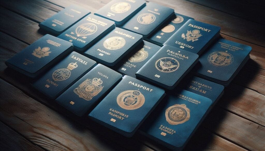
Blue became a regional visual language before it became a search trend.
Much of the modern public fascination with passport colors stems from online explainers and travel trivia, but governments have used color to organize authority long before travelers began treating passport design as a form of geopolitical branding.
Dark blue works especially well because it looks formal without appearing austere, hides wear better than lighter shades, and gives gold or white lettering a strong contrast, which matters for a document handled constantly in airports, ports, and consulates.
Across the Americas, that design logic aligned with a broader cultural and political preference for blue as a color associated with trust, stability, oceans, flags, commerce, and a certain sober style of official paperwork.
In the Caribbean, this tendency became even more visible once regional integration projects began standardizing elements of passport presentation, allowing individual states to preserve sovereignty while also signaling membership in a wider community of movement and administration.
CARICOM helped reinforce that pattern by encouraging common colors and formats for community passports, which made blue feel not merely national but also regional, a subtle mark of shared institutional belonging across many island and coastal states.
In South America, similar dynamics shaped the spread of blue covers within integration-minded states, where the passport began to function not only as proof of citizenship but also as a quiet badge of participation in a broader regional order.
The phrase “New World” is useful, but it oversimplifies.
Travel writers often say blue means the “New World,” and that shorthand survives because it captures a visible pattern across the United States, Canada, the Caribbean, and many countries south of the Rio Grande.
Still, the phrase can be misleading if treated as an official doctrine, because no treaty requires New World countries to choose blue and no global passport code assigns specific colors to particular regions.
What the phrase really describes is a historical clustering effect, in which countries in the Americas often adopted similar-looking covers because of shared diplomatic habits, regional imitation, trade-bloc aesthetics, and the visual influence of neighboring states.
Once a dominant color becomes common in a region, it also becomes self-reinforcing because bureaucracies tend to preserve familiar state symbols, printers work within established design traditions, and governments rarely change passport design without a broader political reason.
That is one reason blue passports keep reproducing themselves across generations, with redesigns usually focusing on chips, data pages, microtext, and polycarbonate security rather than dramatic changes to the cover color itself.
Even when passports undergo major technological overhauls, as with biometric upgrades and anti-counterfeiting redesigns, many governments preserve the cover color because citizens already recognize it as part of national identity.
The United States gave blue passport symbolism extra staying power.
The United States did not invent the blue passport, but its global visibility made the color more culturally prominent and helped reinforce the idea that blue belonged naturally to Western Hemisphere travel documents.
American passport practice also illustrates how passport color can carry multiple meanings at once, as the United States uses different colors for different document categories, reserving blue for the ordinary passport associated with everyday travel and citizenship.
That distinction still appears in official State Department guidance for special-issuance documents, which explicitly refers to regular travelers as holders of a tourist blue passport, underscoring how strongly blue is tied to the standard civilian document.
Once the United States normalized blue at scale, the color gained another layer of symbolic weight across the hemisphere, especially in countries that already associated dark blue covers with modernity, commerce, and Atlantic-facing political identity.
Canada reinforced that visual family as well, and even when Ottawa rolled out a security-focused redesign rather than a symbolic overhaul, reporting on the new Canadian passport series showed how firmly the country remained within the established blue-cover tradition.
Taken together, the United States and Canada helped cement blue as the most recognizable civilian passport color in North America, making the shade feel almost default across the wider hemisphere.
Regional blocs turned a color choice into a recognizable pattern.
One reason blue appears so often in the Americas is that regional organizations rewarded visual convergence without fully erasing national branding, which is an ideal formula for passport design in politically diverse neighborhoods.
A government can keep its own coat of arms, national name, and internal security architecture while still using a cover color that resembles nearby member states, thereby signaling cooperation without surrendering sovereign control.
That balance mattered in the Caribbean, where community identity and free-movement aspirations encouraged similar-looking documents, yet where each state still needed its passport to remain unmistakably national in law and symbolism.
It mattered in South America as well, because common blue designs could communicate compatibility with regional frameworks while still leaving room for each country’s language, crest, typography, and documentary traditions.
This is why the blue passport cannot be reduced to fashion: in many cases, the color sits at the intersection of administrative pragmatism and political messaging, quietly telling border officials that a document comes from a state embedded in a familiar regional network.
For ordinary travelers, the effect is subtle but real, because a stack of blue passports from the Americas creates a visual impression of shared institutional culture even when the issuing countries have very different histories and legal systems.
Blue also wins because it looks official, durable, and hard to improve upon.
Political symbolism matters, but bureaucratic conservatism matters too, and passport agencies are famously conservative because travel documents must communicate authority before they are ever opened or electronically scanned.
Blue succeeds in that role because it resists visible grime, maintains strong contrast with embossed crests, and ages gracefully across years of use, which is especially important for documents that spend a decade moving through bags, pockets, and inspection booths.
A passport cover must look dignified from a distance, and dark blue reliably delivers that effect without the overt ideological baggage that some governments may associate with red or green.
It also travels well across political transitions, because a government can change leaders, redesign internal pages, and strengthen biometric features without having to justify why it abandoned a cover color citizens had come to recognize as normal.
That continuity has value in itself, since passports are among the most symbolic documents a state issues, and abrupt cosmetic changes can raise avoidable questions when administrations would rather emphasize stability and institutional maturity.
For that reason, blue often survives changes in monarchs, constitutions, printing contractors, and security generations, proving that the most durable design choices are sometimes the least dramatic ones.
Passport color says something about identity, but it never tells the whole story.
A blue passport can suggest that a country sees itself as part of the Americas, part of a regional bloc, or part of a modern administrative tradition that values continuity over theatrical symbolism.
What it cannot do is tell you how strong the passport is, how many countries it can access without a visa, how secure the document is against fraud, or how much geopolitical leverage its issuing state actually commands.
Those questions depend entirely on different factors, including diplomatic agreements, border policy, biometric technology, consular capacity, and the credibility of the civil registry behind the booklet.
That is why sophisticated passport analysis looks beyond the cover and into the underlying infrastructure, a point often emphasized by specialists working on identity planning, documentation strategy, and lawful second-citizenship pathways through firms such as Amicus International Consulting.
In that world, the cover color may shape first impressions, but the real substance lies in issuance standards, legal eligibility, document integrity, and the passport’s ability to function smoothly within banking, travel, and compliance systems.
For clients exploring mobility options, that broader perspective matters far more than color trivia, because a visually attractive passport is useless if it lacks legal durability or operational credibility in the places where it will actually be used.
Blue passports endure because they satisfy both emotion and administration.
The strongest state symbols usually survive because they work on two levels at once, giving citizens an emotional sense of continuity while also serving mundane bureaucratic needs without disruption or unnecessary redesign costs.
Blue passports do exactly that across the Americas, where the color feels maritime, continental, respectable, and institutionally safe, all while remaining practical for manufacturing and durable for long-term everyday use.
They also benefit from repetition, because once generations of citizens grow up seeing blue as the normal civilian passport cover, any different color can start to feel unfamiliar, even if there is no legal reason it must.
That habit becomes part of national memory, and national memory is one of the quiet forces that shape document design far more than most travelers realize when they search online for symbolic explanations.
The continuing popularity of blue, therefore, reflects both inherited meaning and bureaucratic inertia, which is often how state aesthetics persist long after their original rationale has faded from public discussion.
In other words, blue passports remain common in the New World not because history froze in place, but because the color kept proving useful whenever governments had another opportunity to change it and chose not to.
Why blue still matters in a biometric age.
Some observers assume that cover color has become irrelevant now that passports increasingly rely on encrypted chips, facial images, laser engraving, and machine verification, yet symbolic design still matters in the age of digital border control.
The booklet remains a physical object of state authority, and its outward appearance still frames how citizens experience nationality and how officials visually sort documents before scanners and databases do the deeper work.
That is one reason countries continue to invest heavily in secure design while maintaining familiar cover identities, a balance evident across the modern passport industry and in the growing market for lawful mobility planning, second-citizenship analysis, and document strategy described in Amicus guidance on second-passport solutions.
Blue endures because it bridges old and new, carrying the historical visual language of the Americas into a period when passport value depends less on ink and paper than on interoperable systems, verified registries, and trusted issuance procedures.
So when people ask what a blue passport means, the most accurate answer is not that it follows a rigid rule, but that it reflects a powerful regional habit shaped by geography, integration, administrative conservatism, and the long afterlife of familiar state symbols.
And when they ask why New World countries prefer blue passports, the answer is equally clear, because blue became the color that best combined continental identity, regional mimicry, durability, official gravity, and the political comfort of continuity.